
Customers want to shop online for Asian products conveniently - grocery sites are typically clunky and outdated, resulting in an unenjoyable shopping experience that is not user friendly.
As asian supermarkets aren’t as commonly accessible as local supermarkets, such as Tesco or Sainsbury’s, consumers often rely on other means to source their favourite asian products.
Online grocery sites are a convenient alternative to access oriental products as customers can order products to be delivered straight to their door, rather than having to travel somewhere far to buy these goods.
While online sites are easily accessible, not all are helpful as some websites do not provide the ability for purchases. In some cases, grocery sites are informational to learn more about the company with basic information such as where to locate the nearest store or opening times.
With few store locations, a new design will improve user experience and encourage online purchases.
To achieve this, the following will be delivered:

There are only a handful of major competitors in the UK that dominate the Asian grocers space such as Loon Fung, See Woo and Hoo Hing.
Korean foods and products have also gained immense popularity over the years and large Korean supermarkets such as Oseyo, H-Mart, Korea Foods and Seoul Plaza have opened stores in the UK, carrying popular Asian products alongside Korean products.
British grocers have taken opportunity in this growth and have started to stock popular Asian products in their World Foods section to cater to these customers at a competitive price but struggle to provide variety.
Before conducting user research, the site has been evaluated to assess current site content and identify strengths and any areas for improvement.
.webp)
.webp)
.webp)
.webp)
.webp)
.webp)
.webp)
To gain deeper insights into customer experiences with grocery sites, user interviews have been conducted to uncover pain points, challenges and to find solutions to address user needs.
Customers need stronger incentives to purchase their Asian products online.
Participants have cited the differences between Asian versus non-Asian grocery sites when providing insights regarding their online shopping experiences.
The general trend is online grocery shopping for Asian products is less common/popular. There needs to be stronger incentives for customers to purchase their Asian products this way, namely user friendly sites, better site designs, promotional offers and reliable delivery services.


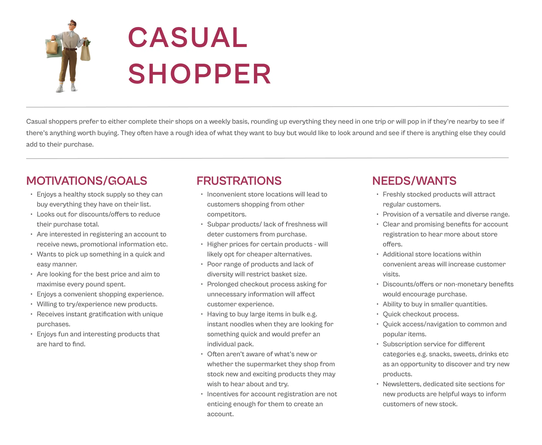
Utilising research findings, user personas/groups based on customer types have been created to capture two key groups that represent the customer base, eliminating common overlaps. These are the ‘casual shopper’ and ‘bulk buyer’.
Casual shoppers prefer to either complete their shops on a weekly basis, rounding up everything they need in one trip or will pop in if they’re nearby to see if there’s anything worth buying.
Bulk buyers make purchases in large quantities either for commercial purposes or to stock up which presents advantages such as economies of scale, general ease and convenience, reduce in overall waste and transport miles.

Categories were determined either by product type or product of origin.
With so many different product categories available, an open card sort of 20 cards was conducted.
Users approached card sorting based on similarity and common themes between items. A few said they determined their groupings from what they can observe at supermarkets.
Challenges involved items falling into multiple categories, leading to uncertainty when classifying certain products e.g. chopsticks and made their own category e.g. utensils or tableware.
As some users grouped items based on how products are placed at supermarkets, I’d need to replicate these groupings based on how Cheerful Links stores are set up to avoid confusion and allow shoppers to follow their instincts.

From research findings, we learned that users find grocery sites overwhelming and sometimes do not know how to begin their online shop.
I outlined a task flow detailing top line steps a customer would take when initiating their search to point of purchase.

In addition, I mapped out user flows to understand the different interactions and decisions a customer might make to find potential pain points and areas for improvement to streamline the user experience and improve usability.

To start the ideation process, I sketched a few variations for key site pages. Using my sitemap and feature roadmap when organising the information architecture of each page, I played around with different elements to visually assess what parts made sense for the user, logically.
.webp)
.webp)
.webp)
.webp)
.webp)
.webp)
Taking different components from each sketch, I applied various combinations when building out mid-fidelity wireframes.
.webp)
.webp)
Following Cheerful Link’s existing design system, branding and patterns, I created a UI kit with updated elements that will be implemented into the new site design which would still allow me to remain consistent with the current interface.

I applied the UI kit to the mid-fidelity wireframes, bringing the designs to life.
Mid-fidelity screens were also created for mobile and tablet with high-fidelity versions shown below to exhibit how content will adapt at different breakpoints and how the design will change responsively.


The prototype tested the entire flow from browse to purchase with additional desktop screens designed when building the prototype.
Scenario task: user is looking to buy a cup noodle and wants to add it to their basket for purchase
Note: This prototype includes the priority revisions that were made after the usability tests.
Users expressed how clean and well organised the site looked, an approachable shopping site makes their experience less overwhelming.
Many said the layout was quite intuitive with interchangeable tabs, reducing clutter and information overload.
Overall navigation and checkout progression was simple and easy to follow.
Majority of the pain points uncovered were related to the sizing of text and imagery, which, paired with the large amounts of white space hindered user experience. For example, increased unnecessary scrolling and empty appearance/feel.
Considered revisions included the flow of some sections, layout of specific pages, reduction of white spaces, text and images and additions to the checkout process that would better assist the customer.

%20CL%20Priority%20Revisions.webp)
Some users wondered if there was a way to quickly access contact information or receive support/help from the company. Another user thought it was peculiar to have the language icon next to the shopping bag icon.
A banner has been added at the top to highlight crucial information and placed the language icon in the corner. In replacement of the previous icon, I added an icon for customers to access their account/profile.
Users said the images were quite large and felt there was space to accommodate another product card in the carousel. Another product card has been added to reduce the space between the cards and make the images smaller in size.
%20CL%20Priority%20Revisions.webp)
Users pointed out how the content was stacked, following a horizontal layout when scanning through the page. They suggested rearranging the site sections and mixing up the layout.
The product tabs have also been prioritised above the ‘Story’ and ‘Instagram’ sections as users felt they reached the end of the page when they saw the ‘Story’ section.
Some users felt it would be helpful to know what the name of the dishes/recipes were in this section. Now, when users hover the recipe card, the recipe name would appear so users can quickly see what the recipe is.
%20CL%20Priority%20Revisions.webp)
Users felt the product images were too large so these were reduced to make the page seem less empty. They also wanted the option to change the grid layout on the results page so this has been added in at the top next to the filter.
The breadcrumbs has been removed because users felt this was irrelevant and unnecessary as the journey from the homepage to the results page is very minimal.
%20CL%20Priority%20Revisions.webp)
Previously, the section beneath the product information felt empty and like there was something ‘missing’. Therefore, the product tags have been moved from lower down the page to right below the ‘add to favourites’ and ‘check in-store availability’ part which felt more suitable.
Users also felt the the product information on the product page was overwhelmingly text heavy and a lot to take in. They also said this wasn’t particularly important to them or most people so to reduce the amount of text shown at first sight, customers can now expand the paragraph when they click ‘see more’ for those who want to read more.
%20CL%20Priority%20Revisions.webp)
Users felt the shopping bag icon at the top was unnecessary so this has been removed.
The products in the cart has been adjusted slightly with smaller image sizes as users felt they were too large. A scroll bar has been placed on the side so users can easily scroll through if they have a large order.
The summary box has been extended so it’s more informational with an added field where users can apply their discount code to see if it works before they begin checkout. The previous colours felt out of place so this has been replaced with an outlined box rather than a fill so it feels less outdated. The ‘delivery’ and ‘shipping’ information has been placed underneath so reduce white space, making the page feel less empty.
%20CL%20Priority%20Revisions.webp)
Added a screen before customers initiate the checkout process, therefore it’s clear that they’ve either logged in, signed up or checked out as a guest before payment.
%20CL%20Priority%20Revisions.webp)
Some users wanted an indicator for mandatory information by having an asterisk. Some also said the colour of the form felt quite outdated so the brand’s primary colour has been applied.
The order list on the right has smaller image sizes to feel less cluttered and reduce the amount of effort needed to scroll.
Tick boxes have been added for options to use the same billing address as the delivery address and whether customers are happy to be contacted about their order.
%20CL%20Priority%20Revisions.webp)
Users noted having an indicator for mandatory information by having an asterisk. For the option of signing up, another user mentioned how typically when signing up and creating an account, you would be asked to re-enter your password to ensure they match so this extra field has been added.


If you like what you see and want to work together, get in touch!
rachwu@hotmail.co.uk