
As safety concerns continue to grow over the years, location sharing apps provide users with a sense of security and assurance. Whether you are travelling, trying to locate your friends or making sure a close one got home safe, location sharing and tracking gives users a peace of mind.
Design a location mobile app with unique features to attract users and encourage usage.

People use location sharing apps for various reasons, such as staying connected with their friends and family, coordinating meet-ups, sharing directions, and providing peace of mind.
Such apps are especially helpful in situations where people need to find each other in a crowd or when traveling in unfamiliar areas as you can now share your real-time location.
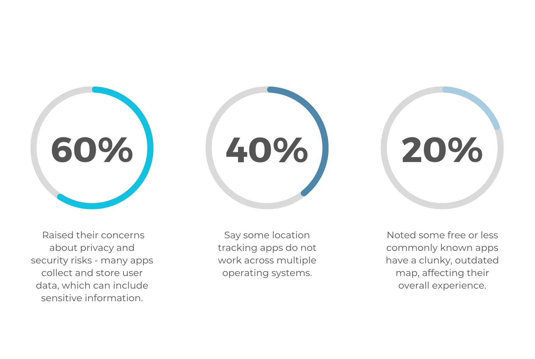
One of the primary reasons people use location sharing apps is for safety reasons. There have been cases where people have gone missing and their phones were found in an area of high crime rate. These apps can help police figure out where the person was before they went missing.
However, it is important to be mindful of the potential privacy and safety concerns associated with the use of these apps. Users should only share their location with trusted contacts and should be careful about the permissions they grant to these apps. It is also important to review the privacy settings of any location sharing app to ensure that your data is being handled appropriately.
While there are many apps out there, there is no perfect app - the majority are either limiting, lacking or are just meeting the minimum in doing what it says on the tin. Everyone uses location sharing for different reasons and situations which needs to be considered when building and designing such an app.
Understand the needs and wants of potential app users and address any concerns or barriers towards using location apps.
There isn’t an app that is unique enough (outside of WhatsApp and FindMy) for me to download and use.

Taking a look at the market, I went through the different features key competitors use so I could assess which features were the most common/popular.
In addition, I was able to learn about any interesting features some competitors had that I could apply to my app in combination with the features participants mentioned in my research.

As people use location apps for various different reasons, I've considered the different situations and user perspectives people may have when using location apps and created 4 personas.


Taking insights from my interviews, I listed user needs and wants and organised the feature roadmap in order of requirement and priority.
As there's quite a lot of features I can incorporate to this app, I have categorised each feature and will focus on the ‘must haves’ and majority of the ‘should haves’.
.webp)
.webp)
.webp)
.webp)
.webp)
.webp)
.webp)
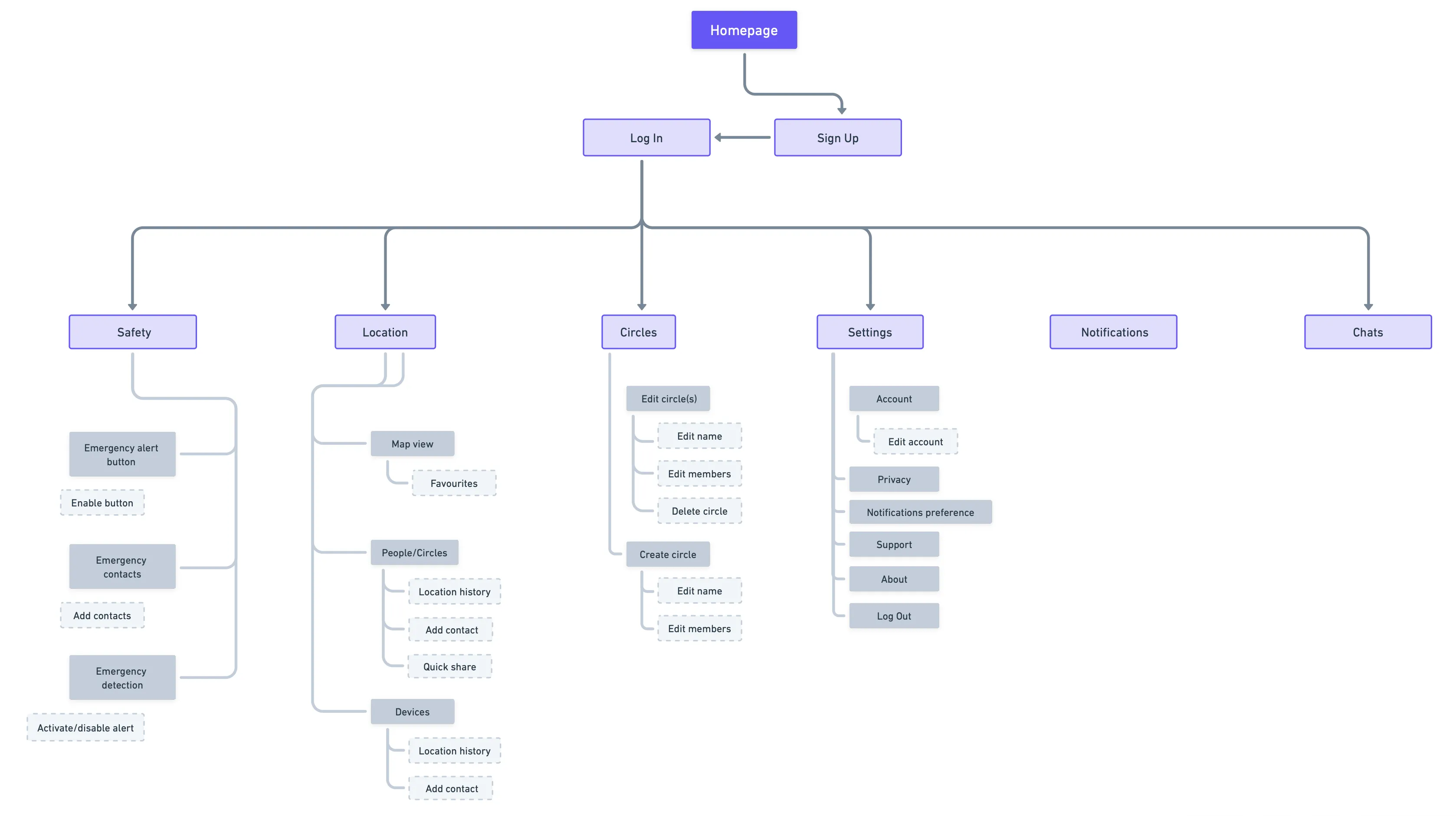
To illustrate the structure and organisation of the app, the app map provides an overview of the different screens, features, and user flows within the app.
This helps within the design process to understand the overall navigation and hierarchy, and ensures that all necessary screens and functionalities are accounted for.
Thinking about the different screens and features I will have, below illustrates the user flow to understand the different interactions and potential decisions a user might make as they use the Inner Circle app.
This will aid in discovering any pain points and areas for improvement to streamline the user experience and improve usability.

To outline the basic structure and layout of the app, a series of low-fidelity sketches were created for various key screens.
At this stage, it helps to visualise the layout, content hierarchy, and user interactions before thinking about the visuals.
.png)
.webp)
.webp)
.webp)
.webp)
.webp)
.webp)
.webp)
.webp)

Ahead of building the prototype, I used the UI kit to bring the designs to life and converted mid-fi screens to high-fidelity wireframes.
.webp)
.webp)
.webp)
The prototype tested the entire flow from logging in/signing up to exploring all screens with additional screens designed to facilitate app usage and carrying out task flows.
Note: This prototype includes the priority revisions that were made after the usability tests.

Users praised the clean and simple design of the app which made them feel comfortable in approaching and navigating the app. The overall look and feel enabled them to have a good experience - all users noted it was easy and simple to use with most things being easy to pick up and easy to understand.
Majority noted how unique the idea of having ‘Circles’ as it’s something they’ve not come across and is very convenient when it comes to meet ups and group events. The feature is something that certainly helps them stay connected.
Most significant change is the purpose of the emergency button which is now a mass location alert rather than a way to reach emergency services. Users said the ‘emergency services’ button felt redundant as you can use your phone to reach emergency services. Therefore, the button has been updated so you can broadcast your location to emergency contacts only so they can receive an alert in an emergency.
Majority of suggestions and questions were related to the positioning of things or enhance what was already there with extra information/buttons/features.

%20Inner%20Circle%20Prototype%203%20Priority%20Revisions.webp)
One participant noted the appearance of the Log In/Sign Up form, pointing out that it looked slightly outdated with the dark icons giving a harsh contrast against the other colours. Entry fields are now a rounded box following the tabs and buttons on the screen for consistency. The field name forms the line as part of the box to give a sleek and modern look with lighter colour pairing for a subtle feel.
Another user mentioned how overwhelming the Sign Up page looks at first glance with various information requests. Information requests have been reduced where possible e.g. combining 'First Name' and 'Last Name' fields into one.
%20Inner%20Circle%20Prototype%203%20Priority%20Revisions.webp)
A number of participants asked whether user’s locations will automatically update and if so, how long would it take for it to update as it wasn’t very clear. A 'refresh' button has been introduced to allow users to manually update locations on the map.
Another user asked if you would be able to see yourself and where you are on the map to see how far you are from others. A 'pin' icon has been placed on the map for the app user which would show their profile picture so they can see where they are in comparison to others on the map. ‘People’ heading has been greyed out as the user is yet to add contacts and request for them to share their location.
%20Inner%20Circle%20Prototype%203%20Priority%20Revisions.webp)
One user pointed out that the contact list should be in some sort of order to help easily find specific contacts. Also, if the contact list was too long, it would take some time to scroll through the list to add specific people.
The contact list is now in alphabetical order and a search bar has been added at the top to help users find contacts quickly and easily.
%20Inner%20Circle%20Prototype%203%20Priority%20Revisions.webp)
Users were curious as to whether all participants have rights to remove members or delete the circle. It would make more sense to categorise members as such.
Members now have labels to indicate whether they are admin or not, thus, granting them permission to remove members and delete circles.
%20Inner%20Circle%20Prototype%203%20Priority%20Revisions.webp)
Participants wondered if there would be chats for circles (group chats) as this would be good for communicating with all members.
Circle chats have been introduced and can be accessed via a separate tab to navigate the different chat types for organisation purposes.
%20Inner%20Circle%20Prototype%203%20Priority%20Revisions.webp)
Few of the participants commented on the choice of colour used within the chat feed screen, noting how harsh it looked against the soft/light appearance.
Darker colours have been replaced with lighter alternatives to better suit the overall look and feel while adding consistency.
%20Inner%20Circle%20Prototype%203%20Priority%20Revisions.webp)
A handle of users asked if you would be able to change your profile picture on this screen.Another suggested adding an additional option to share location with emergency contacts only which means not everyone will be able to see your location.
A pencil icon has been added to show that users can edit their profile details and changed the colour to a darker grey as the white was washed out against the blue.
In addition, an option to share location with emergency contacts only to provide users with increased privacy control.
%20Inner%20Circle%20Prototype%203%20Priority%20Revisions.webp)
One participant expressed the ‘emergency services’ button felt redundant as you can use your phone to reach emergency services.
Therefore, the emergency button will instead allow you to broadcast your location to emergency contacts only so they can receive an alert in an emergency.
Taking into account the positioning of how people would hold their phones, the button has been placed at the bottom of the screen closer for better usability/convenience.
Another user suggested removing the ‘add emergency contacts’ button as the blue button looked out of place in contrast with the red and replacing it with a heading so it’s clearer. A ‘+’ icon has been added next to the heading where users can easily add to their emergency contacts list.
%20Inner%20Circle%20Prototype%203%20Priority%20Revisions.webp)
Users were confused how the app would get access to their contacts or how they would find their friends and family to request and share their location.
Therefore, a pop up message requesting permission to access user’s contacts for app integration has been added.


If you like what you see and want to work together, get in touch!
rachwu@hotmail.co.uk