

Customers want to shop online for clothes conveniently - inconveniences and difficulties in their search needs to be minimised.
Though successful offline, VZN are late in the game of a digital transformation. The following reasons have created demand for the move to online:
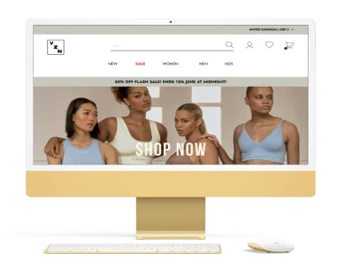
VZN wanted to revamp their site with a fresh new logo and develop a responsive e-commerce website where they can sell their products online.
With a fresh new look, customers are able to conveniently shop at their leisure on desktop or mobile and browse from a wide selection of items.
Adhering to VZN’s brand message and their neutral, clean and clear aesthetic, the site is more user friendly with useful features that help customers to shop online at ease.
To achieve this, the following will be delivered:
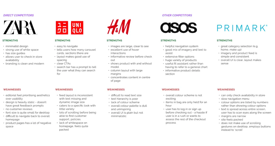
Looking at existing brands in the fashion and e-commerce industry, I examined how these different sites function. Having a look at direct and indirect competitors, I analysed the strengths and weaknesses of their site designs.
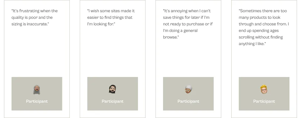
To understand what consumers like and dislike about shopping online for clothes and how they shop in comparison to shopping in stores in order to design a responsive and intuitive website that will address their shopping challenges.
Shopping online for clothes needs to be convenient and hassle free for customers.
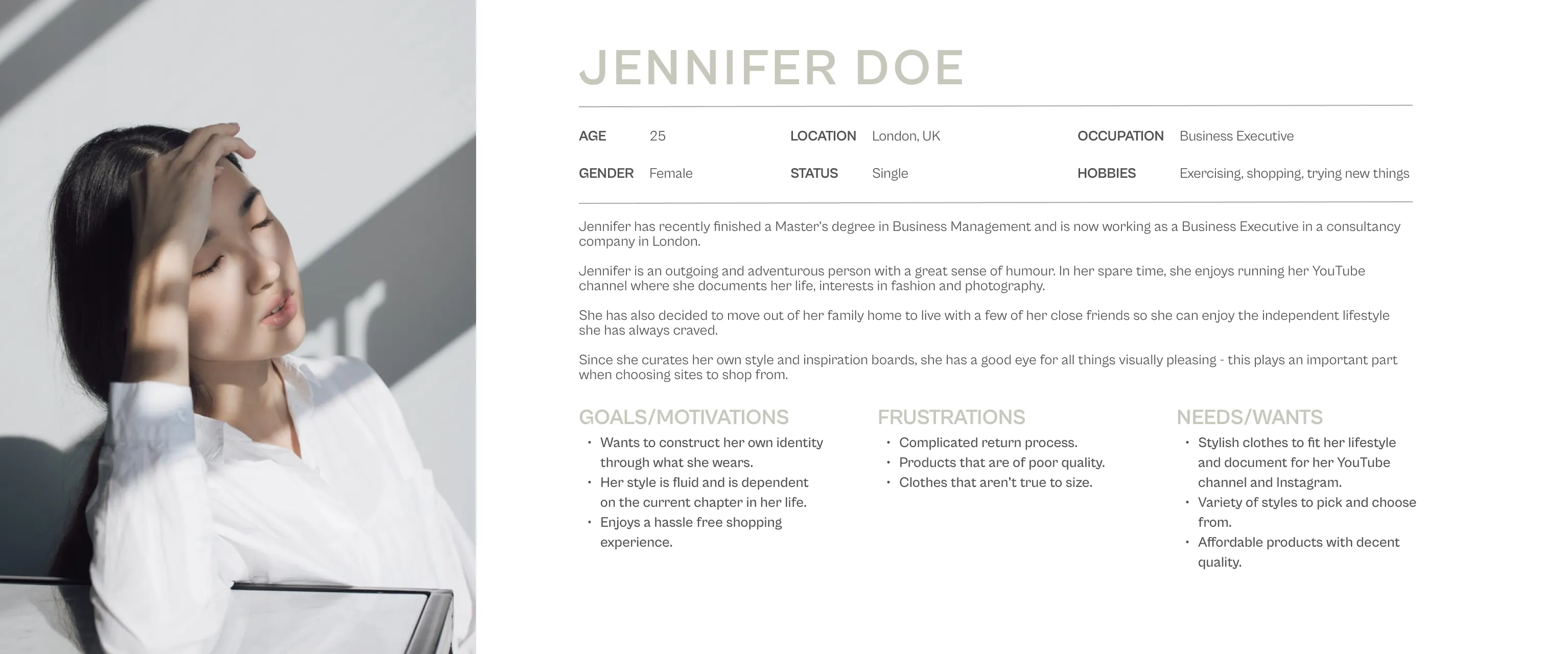
After gathering insights from my user interviews, I constructed a user persona to communicate to the wider team what our typical VZN customer would look like and how they would behave and feel.
With so many different product categories available, an open card sort of 20 cards was conducted.
Card categories were determined by either type and occasion.
Users approached card sorting based on similarity and common themes between items.
A few participants mentioned that some items fell into multiple categories e.g. purple polka dot bow tie and some participants didn’t know what to classify the overalls.
None of the participants sorted by gender or age, although only a few cards mentioned gender or age.

To create a path between the key screens that will form part of my design, I identified the flow that users will follow to complete the main task for VZN.
The main task is to purchase - I created a simple task flow demonstrating the linear process from carrying out a search through to purchasing the item.
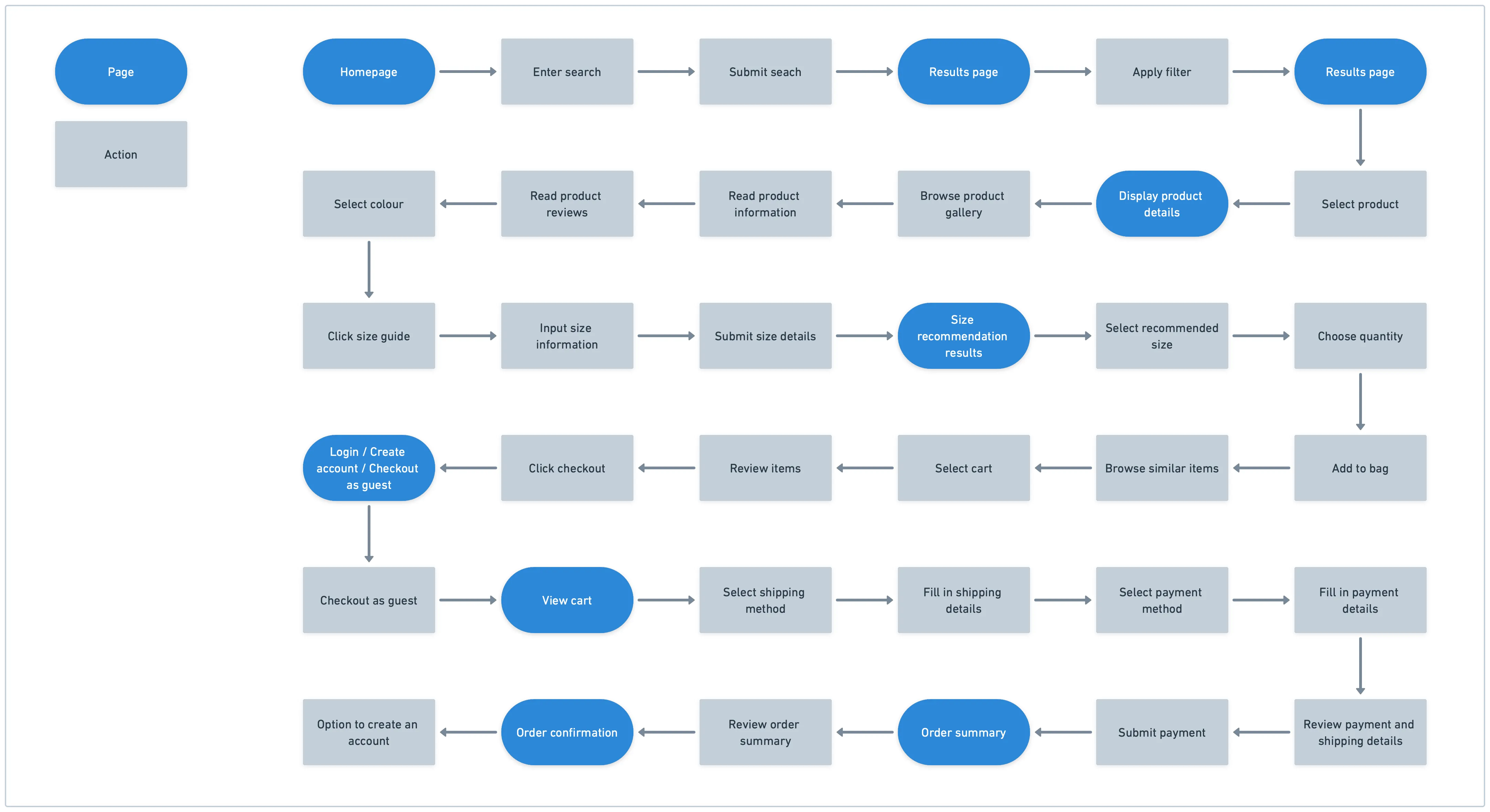
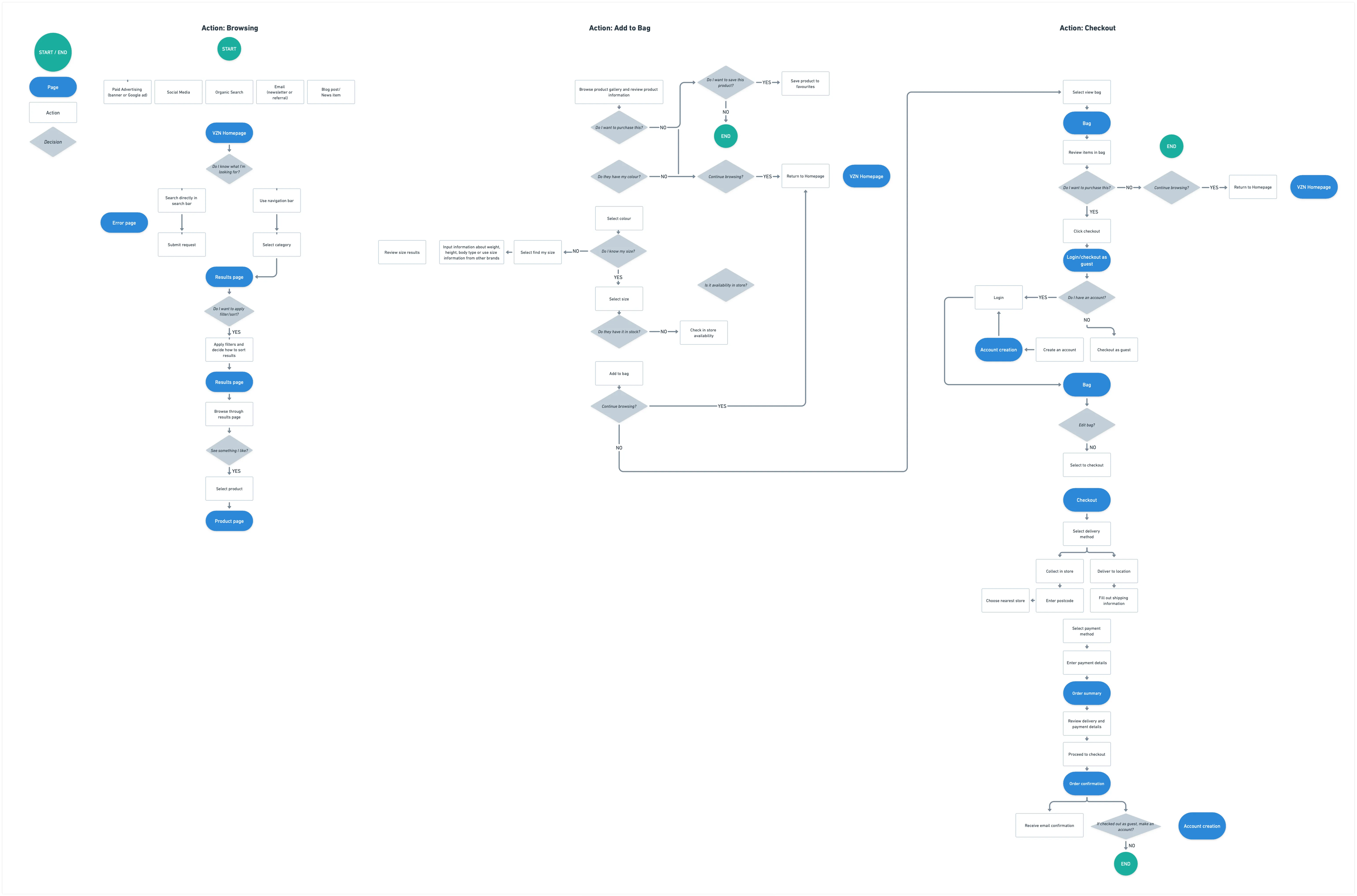
Based on my task flow, I've created a set of flows to illustrate different paths a user can take while carrying out 3 different tasks during the buying process: browsing products, adding to cart and checkout.
Creating a user flow provides a comprehensive look into site needs by considering multiple potential scenarios and the corresponding user tasks.
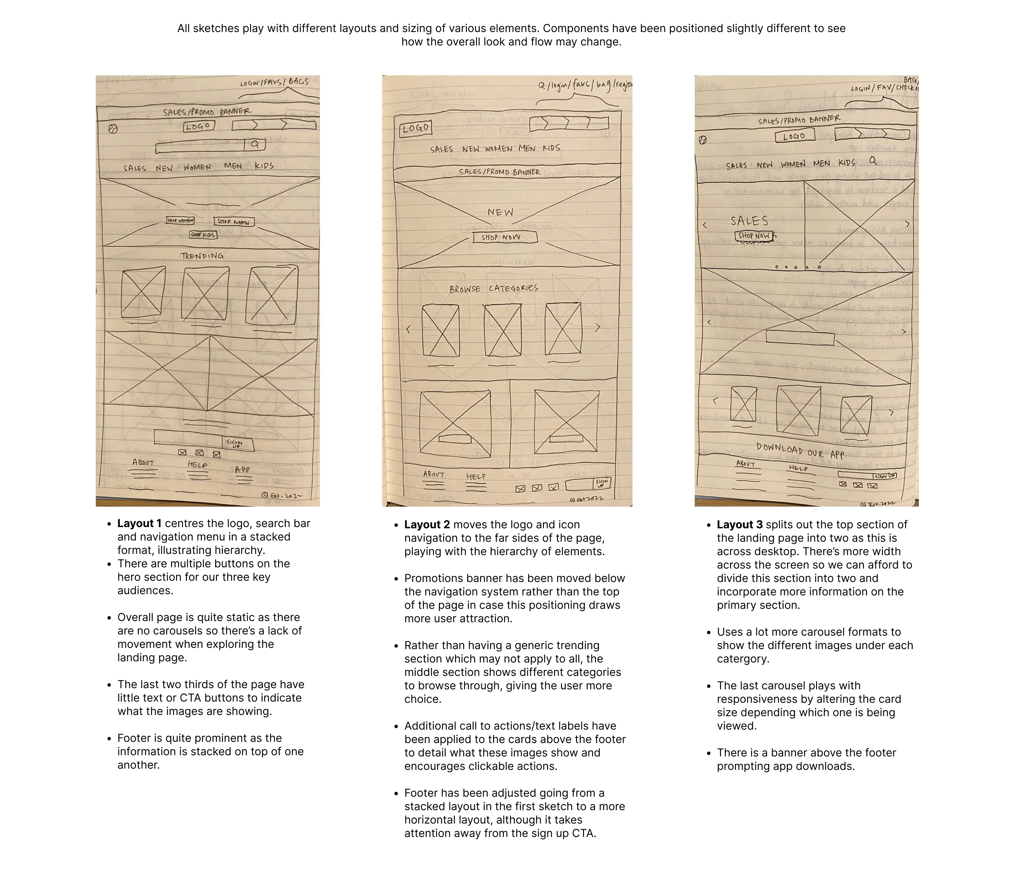
To incorporate my findings into something tangible, I began ideation and designed my wireframes.
I started with low-fidelity sketches to organise my ideas starting with rough layouts to explore different avenues and form a clear vision.
Important sections such as sales/promotions, buttons to the relevant site section for each demographic have been prioritised and positioned at the top of the page. From my research, users don’t want to spend too much time having to search for things and enjoy a site that is user friendly with easy navigation.
Users can easily find and access different parts of the site this way and will benefit from a balanced and modular design as it helps users to find information fast when they are skimming through the page.
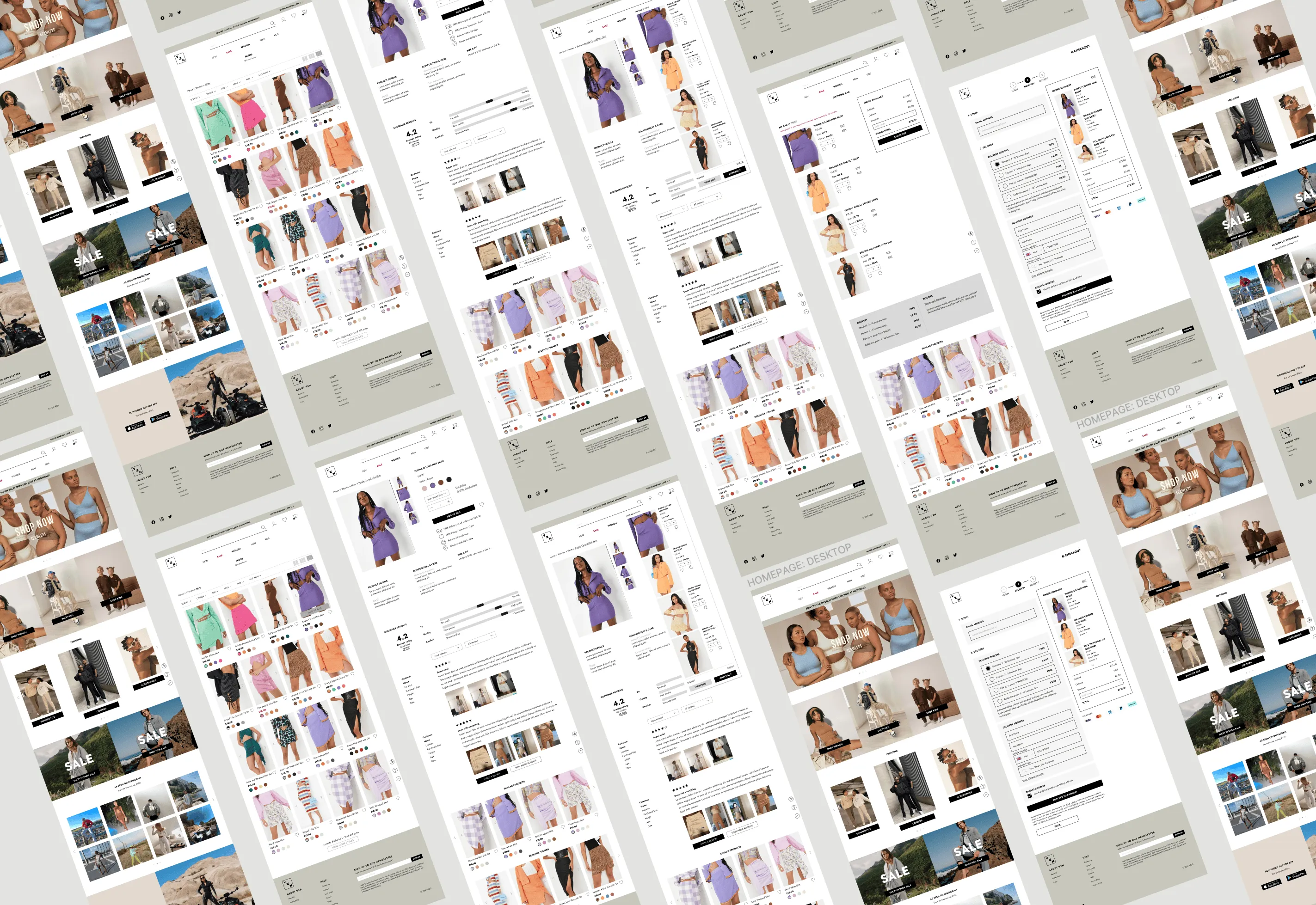
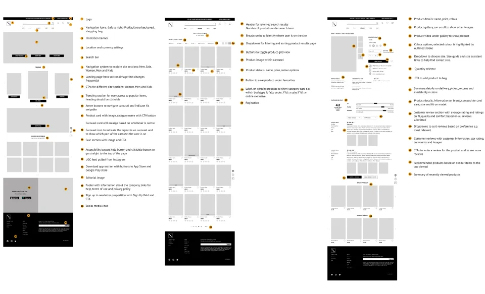
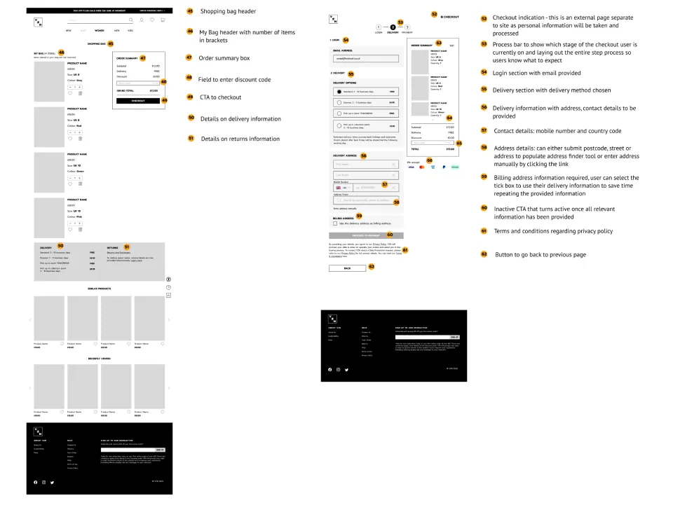
Taking different design elements and layouts from each of my sketches, I created mid-fidelity wireframes for desktop. The frames below illustrate the UI requirements, hierarchy and layout for key pages of the site.Wireframes were created for the homepage, product results page, product detail page, bag summary page and checkout page.
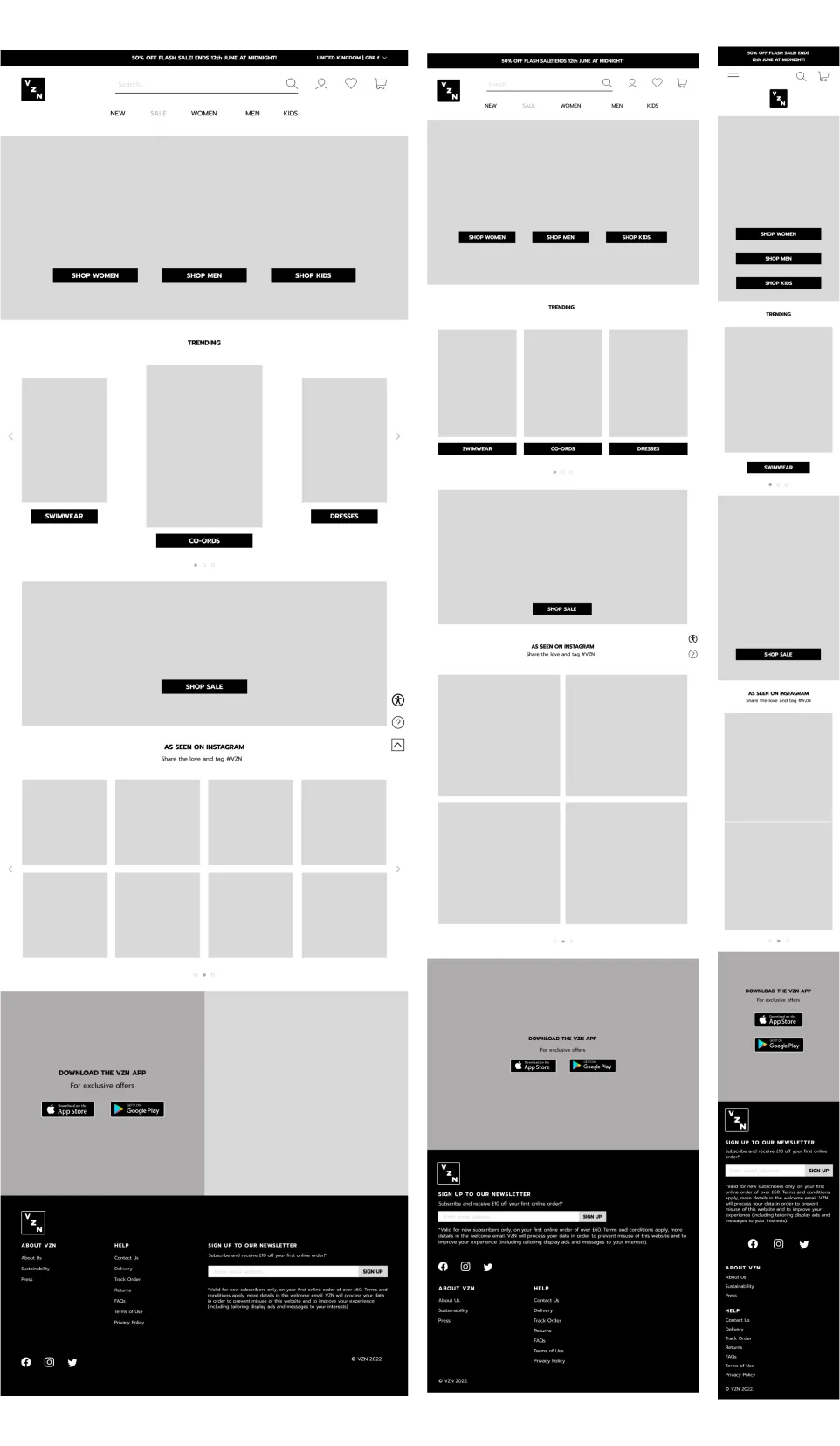
Although the priority was designing for desktop, I created the homepage for tablet and mobile devices to demonstrate the responsiveness of the website and how the design would change based on the different screen sizes.
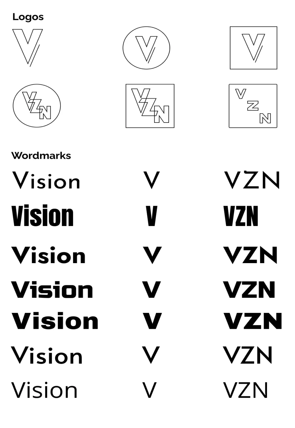
When designing the logo for VZN, I thought about the brand’s personality, its key mission and values. I brainstormed key adjectives to depict how VZN is represented.
After building a moodboard to draw inspiration, I created various designs for the logo and wordmark.
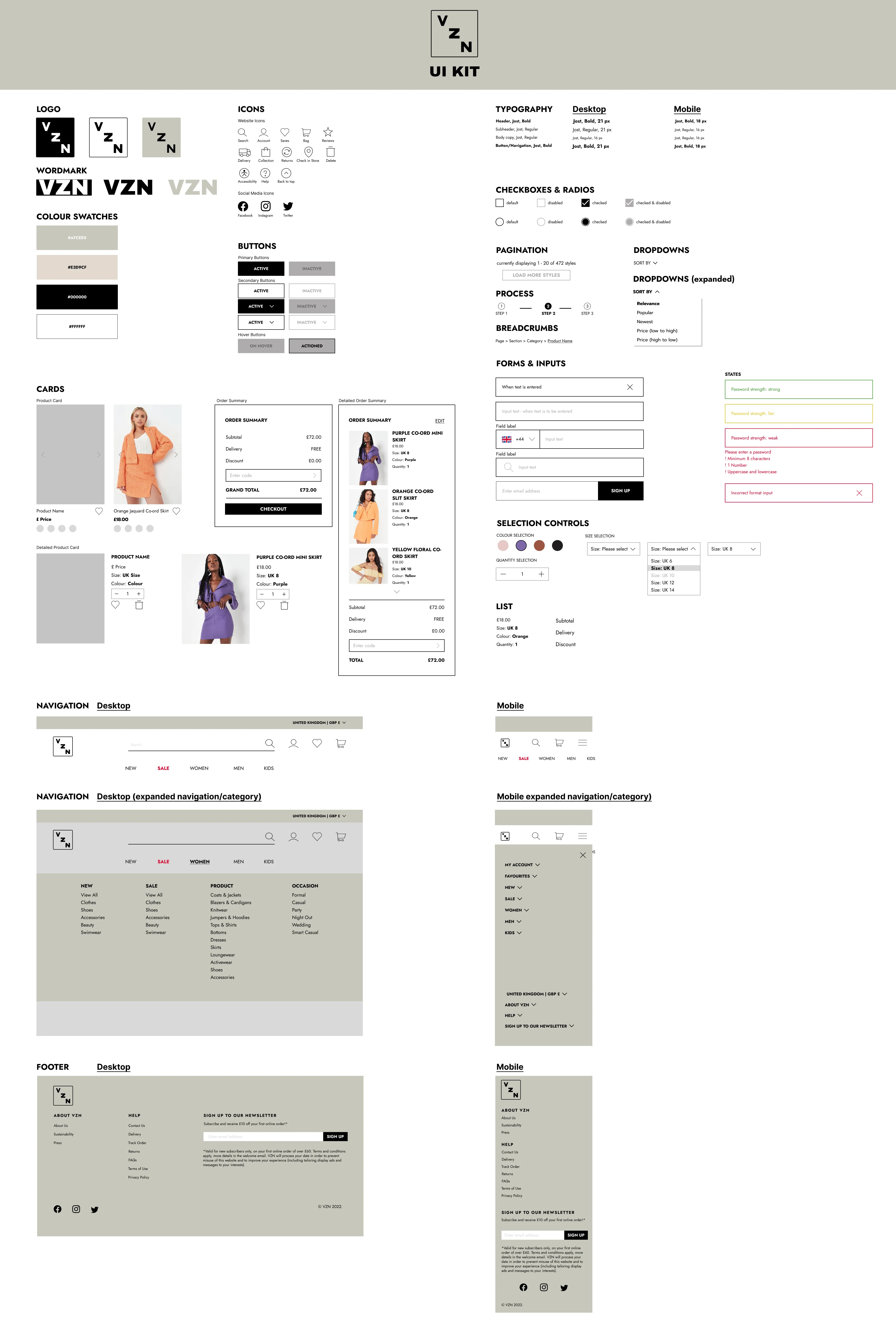
The UI kit was implemented, converting mid-fidelity frames to high-fidelity screens across desktop and mobile.
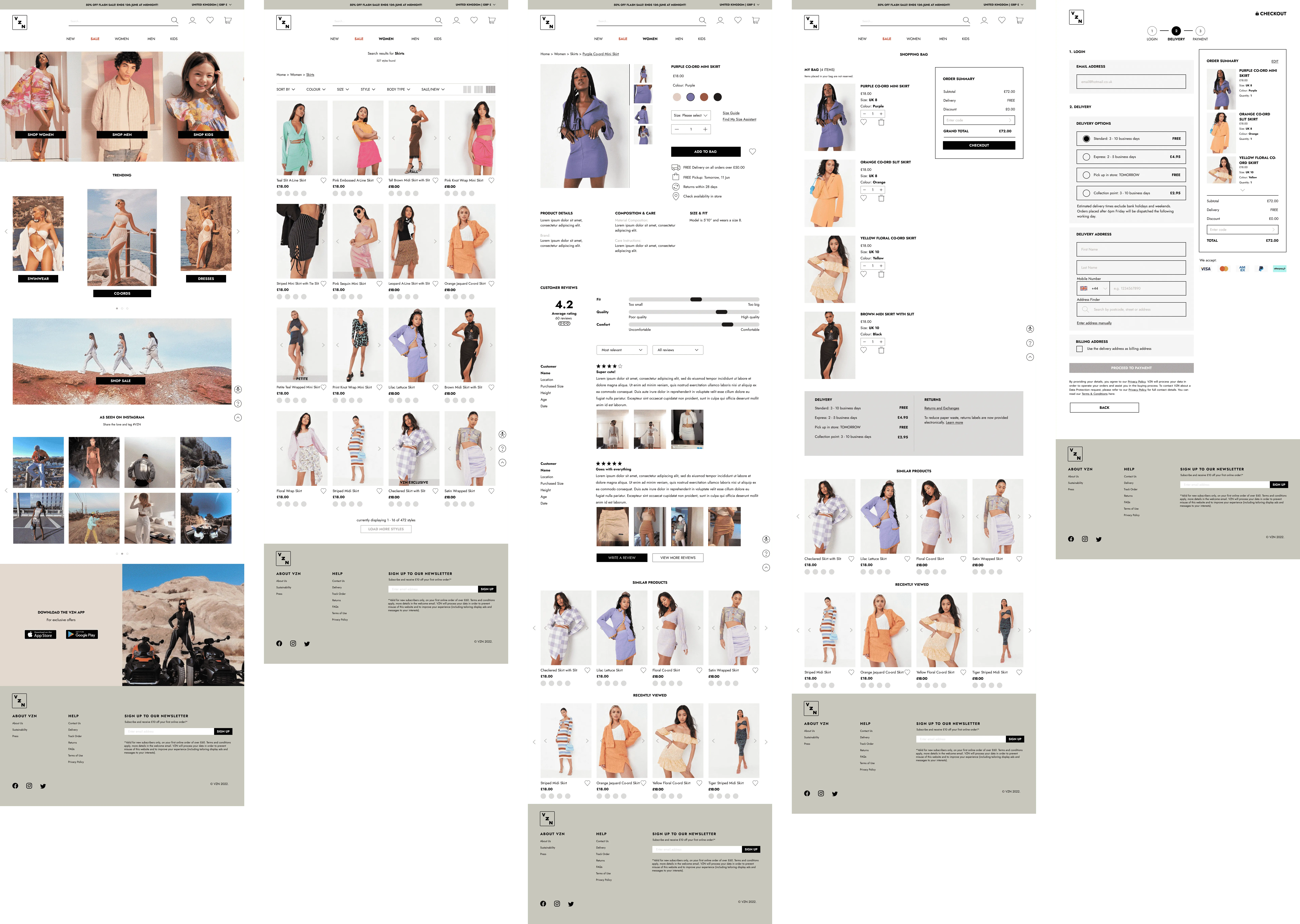
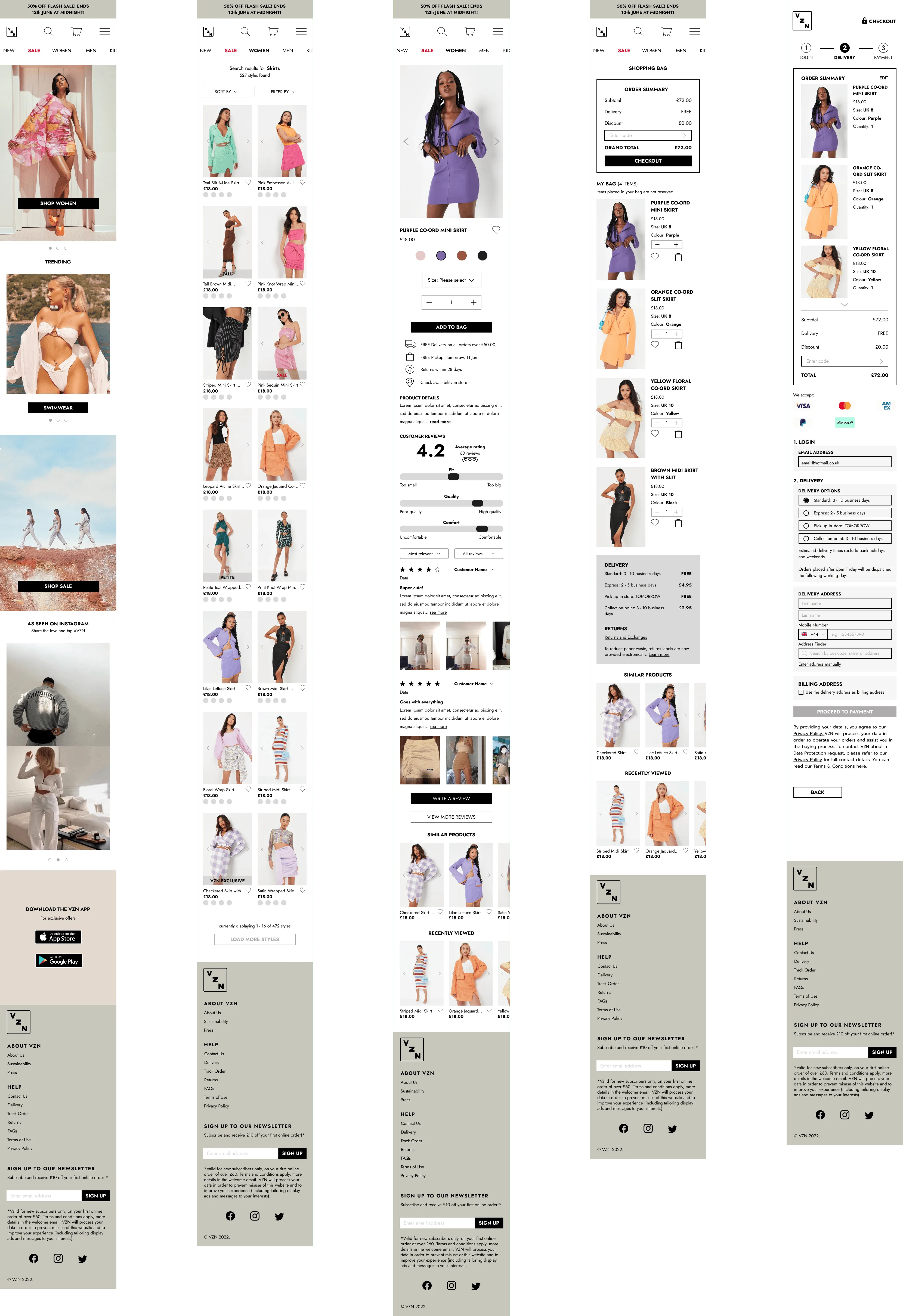
The task for the prototype was to search for a skirt, add to bag and begin the checkout process. Connecting the screens through interactions ensured a seamless working flow and functional design for the user.
Scenario task: user is looking to buy a skirt and wants to add it to their basket for purchase.
Note: This prototype includes the priority revisions that were made after the usability tests.
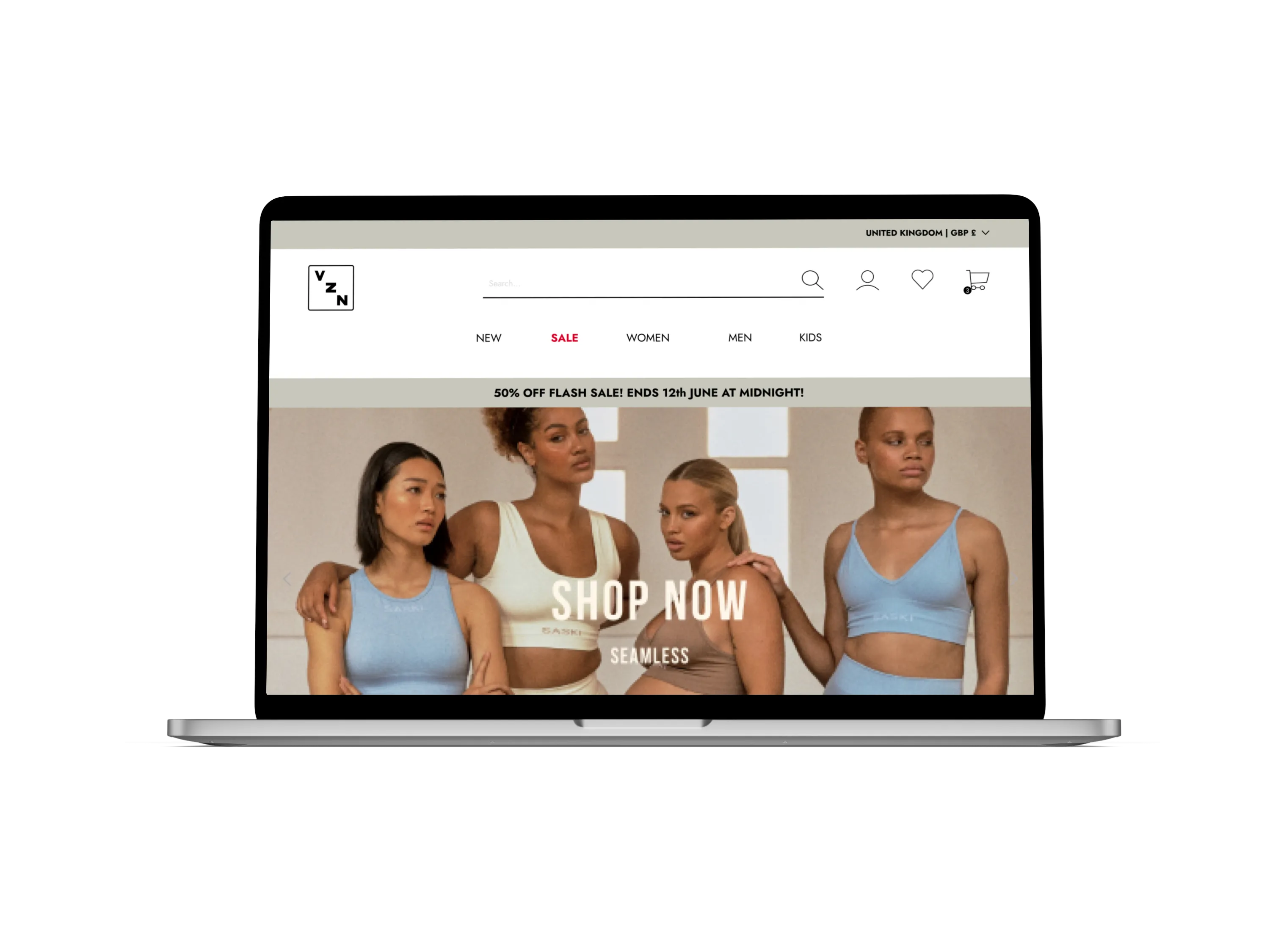
Overall consensus was the site was minimalistic, clean and basic. Participants liked the layout of the site - it’s clear and neat, the elements were well-placed. Some commented on the homepage, noting how neat the page was and how easy it was to navigate.
Users liked how the site design incorporated useful features such as ‘body type’ filter, quick view and video gallery. Such features enabled them to have shopping experience catered to their preferences and made it more convenient.
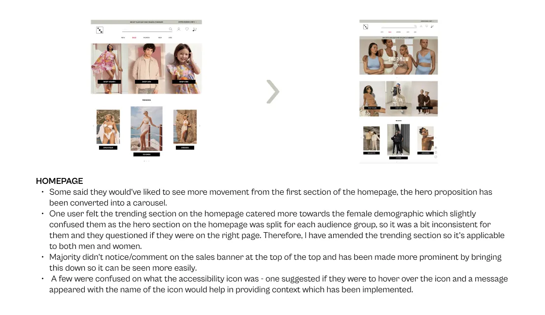
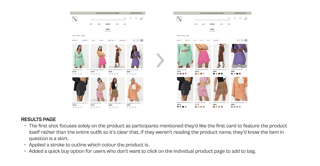
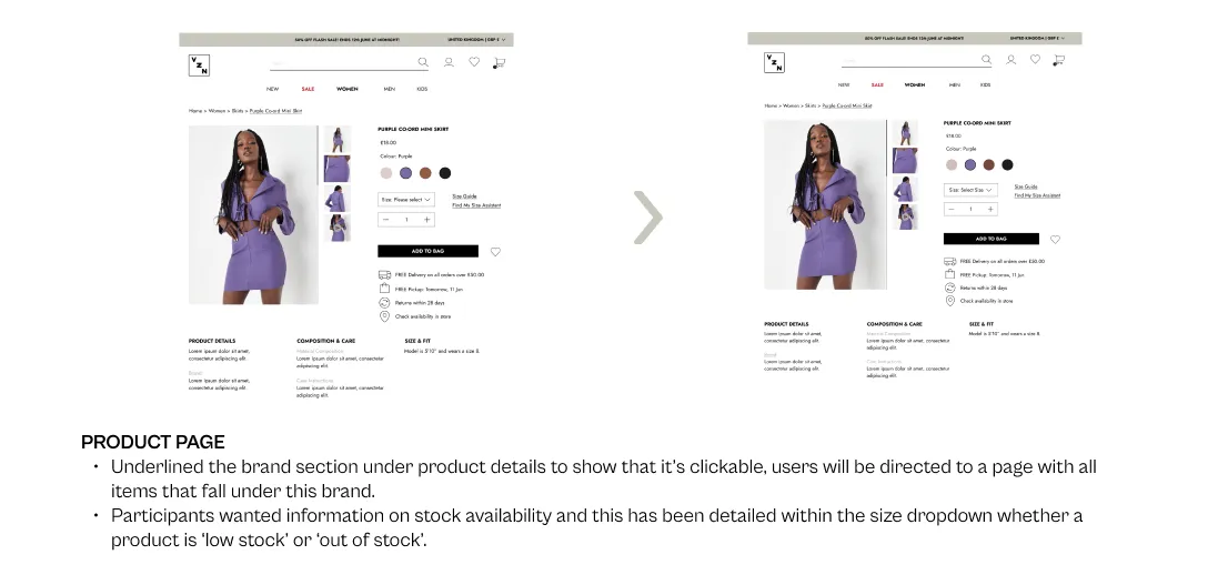
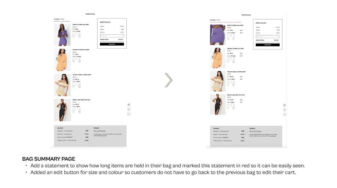
Majority of the design revisions required relate to enhancing existing features and applying low impact and low level changes for incremental convenience when shopping.


If you like what you see and want to work together, get in touch!
rachwu@hotmail.co.uk